Icing on the Cake Rebrand
Design
In overview for this project, the objective was to take an existing, local small business and redesign its brand identity. I chose to work with a local bakery Icing on the cake.
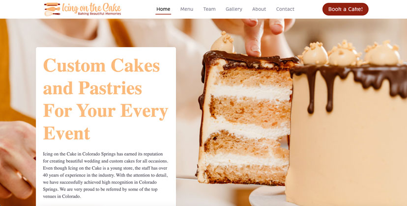
Icing on the cake has been a custom cake business in Colorado Springs, Colorado for 11 years. They have created a strong relationship with their customers and built up an impressive portfolio over the years, that keeps them at a 4.7 out of 5 stars rating on Google. The small business has had many satisfied, loyal customers that vouch for the brand through their raving reviews and continued support of the bakery. The marketing strategy is to give them a rebrand through a new logo and more professional looking website. The goal is to attract the attention of new clientele and have a memorable visual identity that is recognized by many throughout the city.
This is my rebrand of their logo, taking after a stamp logo. I also designed a horizontal logo alternative to be used on the website, stationary, and others formats that won’t support the circle logo. The new logo serves as a refresh for the brand and creates visual distinction for the brand from competitors. The redesigned logo no longer revolves around the finished baked good, but instead the process of creating the cakes and pastries themselves. Using a rolling pin, piping bag and whisk creates a unique visual for customers to associate the business with. It takes after a stamp type logo and has a nice harmony and balance created between the text, curved lines, and visual icons. The font choice is reflective of the movement of icing and captures the brand’s friendly personality and softspoken nature of their employees. It speaks to the brand’s unique selling point of using careful craftsmanship to bring dreamy cakes to life. Icing on the Cake is a bakery that cares about the little details and giving their consumers the highest quality product. Icing on the Cake’s color palette of orange and red also allow them to stand out from competitors and the warm colors are reflective of the brand and kindness they treat their customers with. Another reason this new color platte will make them stand out Is that many competitor companies use the color pink and lean more towards feminine colors.
Details
- Brand Design
- Illustration
- Web Design


To learn more about my process, watch this short video.